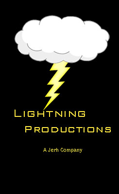
We decided to call ourselves "Lightning Productions" and therefore needed a bolt of lightning in our logo somewhere. We felt it was necessary to add a cloud over the top to make it more realistic. The reason we chose to use a lightning bolt is because we knew it would stand out and felt that because we were making a thriller film we should make it dark and sinister. The bright yellow makes it stand out from the background making it memorable and to stand out from other logos from competitors. We were inspired by the way "New Line Cinema" had set out their logo - the main image was in the middle and the background was black to make the image stand out. This helped us with the positioning of the image (in the center) and the text which was put underneath. We used bright yellow for the text to make it stand out and the colour is associated with the colour yellow. The font we used was sharp and bold which also relates to a lightning bolt.
 |
No comments:
Post a Comment