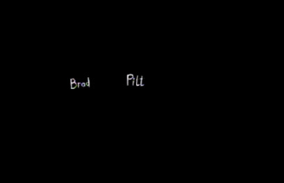
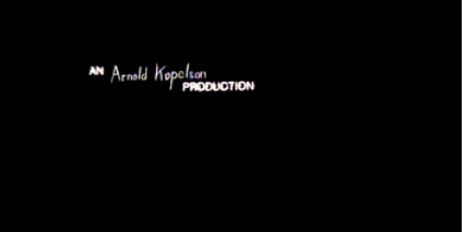
The black screen flashes up and then the titles flash over it, making the white stand out more. Because the titles are in a handwritten for it gives the impression more that the man seen on screen is the murderer as he is also writing in the sequence. The writing also looks jagged and sharp which makes the man seem evil and dark and the fact that the font flashes up quickly, it gives it a "shaky" effect. This relates to the thriller sub-genre well and also adds to the effect of the sharp, jagged font.
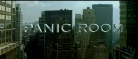
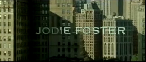
Another title sequence we liked was the Panic Room opening sequence. The titles in there were done somewhat differently in this sequence than to Se7en. The font was big and bold compared to Se7en's small, handwritten font. The font does stand out in the sequence as it is very large and covers most of the screen, with the city skyline in the background showing the setting. The colour scheme of the font is not bright colours compared to the Se7en colour scheme, however because the titles seem to merge with the buildings behind we still notice it just as much.
No comments:
Post a Comment